Märklin Catalogues - the Covers
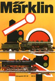
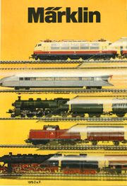
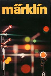
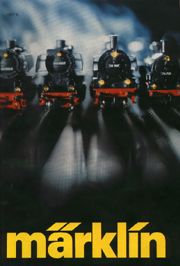
In 1969 the previous painted style suddenly changes: real photos replace watercolours and the layout of the cover is changed each year, so that every new catalogue receives its own personality.
For the first year a photo of a real train is also appearing (althoug rather "stylized", in the form of a silhouette). In a few years, the design of the page is oriented to more "abstract", geometrical solutions, leading to results that, in many cases, can be considered the best of ever.
Bordered images are available also in larger size. Click on the image to enlarge.
Back to the index of Märklin Style
| Page: 1 2 3 4 |

1969
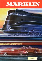
The first cover (of four) where something that is not a railway-related object appears: the Märklin Sprint race-car.
|

1970
|

1971
|

1972
|

1973
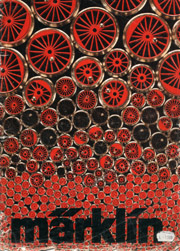
One of the best covers of all: simple, clean, essential.
|

1974
|

1975
|

1976
|

1977
|

1978
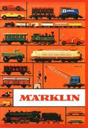
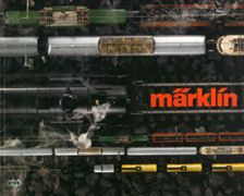
One of the best covers of all: simple, evocative (of the world of railway), geometrically perfect.
|
Catalogues of the Seventies had different covers, but the contents (i.e. the photos of the articles) remain linked to tradition: each article had its onw photo, often retouched to enphasise its best qualities.
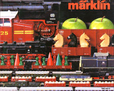
In 1979 a true revolution occurs: the whole catalogue layout is changed. Full-page, un-retouched photos show many articles altogether, as if they were running on a collector's table (see example page for diesel engines).
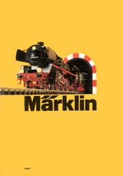
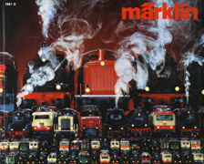
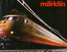
Externally, the catalogue comes back to a portrait format, and the cover is either a view of a single H0 engine or a composition of many vehicles from all three scales (H0, 1 and Z).

1979
|

1980
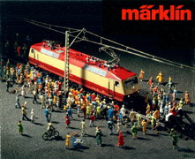
One of the best covers of all: all people arrived to admire the new BR 120 is a really amusing idea!
|

1981
|

1982
|

1983
|
| Page: 1 2 3 4 |
Credits: I downloaded all covers up to 1999 in year 2000 from a website, but I cannot remember its address. Should anyone know it, please e-mail me.
Enlarged pictures as well as newer ones were scanned from original catalogues by myself.
Back to the index of Märklin Style
[Home page]
